 Bitaigen Research
 Exploring the Thought Process from Stock‑to‑Flow Models to the Bitcoin Rainbow Chart, Analyzing Why They Fail, and Offering a 2025 Investor’s Framework for Using These Tools to Assess BTC Price Movements

In this article we outline the core logic behind the Bitcoin Rainbow Chart and the Stock‑to‑Flow (S2F) model, dissect why they frequently break down, and provide a 2025‑compatible thinking framework that readers can borrow to locate more reliable signals amid complex market conditions. We compare the applicable scenarios of the two major tools to help you capture the next wave of volatility.
Why Bitcoin Pricing Models Keep Failing
For more than a decade, a plethora of mathematical models have emerged, each attempting to capture Bitcoin’s wild price swings and deliver forecasts. Yet each time, reality has caused these formulas to crumble. As the community’s popular slogan goes, “All your models are destroyed.” Even the most sophisticated models struggle to withstand sudden large‑scale inflows of capital, exchange collapses, or other extreme events. A billionaire’s abrupt purchase or an institution’s instant liquidation can render an apparently solid framework useless in an instant. This recurring pattern of failure has become an invisible tag within Bitcoin culture.
Investors yearn for a reliable framework to guide entry and exit timing, but Bitcoin’s history repeatedly demonstrates that models tend to work only in specific phases; once the market transitions to a new phase, the model collapses dramatically.
The Rise and Fall of the Stock‑to‑Flow (S2F) Model
The Stock‑to‑Flow model (S2F) surged in popularity in the early 2020s. Its creator, PlanB, borrowed valuation concepts from commodities, calculating the ratio of Bitcoin’s existing stock to its annual new supply (flow) and using this ratio to forecast price. The model once projected aggressive targets: Bitcoin would reach $100,000 between 2021‑2023, and a cross‑asset version later predicted a rise to $288,000 during 2020‑2024. These forecasts were wrapped in mathematical formulas and historical back‑testing, presented as “scientific” predictions.
S2F gained traction primarily because it aligns closely with Bitcoin’s four‑year halving cycle—each halving doubles the stock‑to‑flow ratio, theoretically doubling the price. In practice, the expected breakout never materialized; Bitcoin never breached $100,000 during 2021‑2023. Critics pointed out autocorrelation issues: the curve is heavily influenced by past prices and lacks genuine forward‑looking power. Repeated miss‑predictions eroded PlanB’s reputation, turning what was once hailed as a breakthrough into another failed attempt.
The Survival of the Rainbow Chart
Unlike S2F’s serious mathematics, the Bitcoin Rainbow Chart adopts a more relaxed approach. It does not claim to deliver precise forecasts; instead it exists as a “joke + tool,” which has allowed it to persist even after many other models were discarded.
The chart’s prototype dates back to 2014. Forum user *Trolololo* posted a logarithmic regression model on BitcoinTalk, and *azop* later added rainbow colors and humorous labels—blue for “massive discount,” red for “maximum bubble.” The initial chart was purely entertainment. In 2019, Rohmeo of BlockchainCenter.net gave it a modern facelift; in 2020, influencer Eric Wall shared it on social media, sparking rapid popularity and making it a staple meme among investors.
The Rainbow Chart uses a logarithmic price axis and overlays multiple colored bands to indicate the valuation zone Bitcoin currently occupies. Cool tones (blue, purple) suggest relative undervaluation, while warm tones (orange, red) hint at a possible bubble. The 2022 market crash caused Bitcoin to fall below the lowest purple band for the first time, invalidating the original model. Rohmeo responded in November 2022 with version 2, recalibrating the formula, and issued another update in 2023 to accommodate Bitcoin’s increasingly mature market structure.
How to Read and Apply the Bitcoin Rainbow Chart
The chart’s core is its logarithmic scale—each tick represents a multiple‑fold price increase rather than linear addition, helping to dampen short‑term noise on the long‑term trend.
Rainbow bands are derived from regression analysis of historical prices; each color corresponds to a deviation range, named after market sentiment rather than rigorous mathematics. From top to bottom they are: deep‑blue, light‑blue, green, yellow, orange, light‑red, deep‑red.
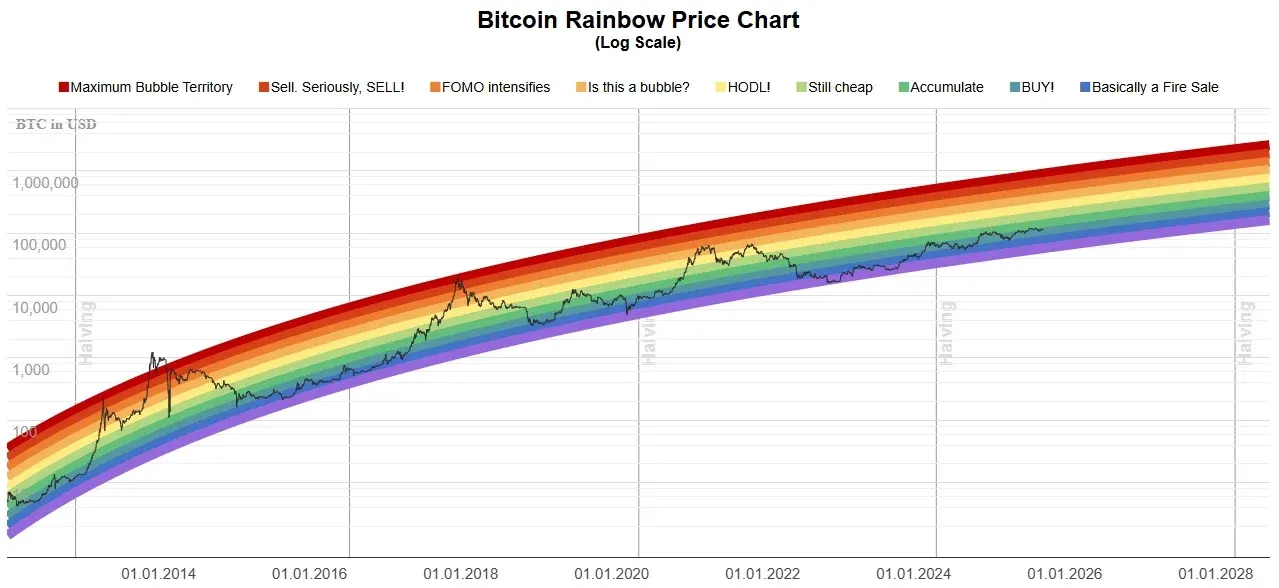
*Bitcoin price rainbow chart (image source: Blockchaincenter)*
Quick Reference of Band Meanings
| Band | Chart Label | Interpretation |
|---|---|---|
| Deep Blue | Basically a massive clearance sale | Extremely undervalued, typically appears at cycle bottoms and can linger in bear markets |
| Blue | BUY! | Strong accumulation zone; long‑term holding often profitable, though short‑term volatility remains |
| Blue‑Green | Accumulate | Slightly undervalued; suitable for steady additions during bull‑bear transitions |
| Light Green | Still cheap | Relatively low compared to the long‑term trend; often followed by consolidation and upward breakout |
| Yellow | HODL! | Neutral zone; neither strong buying nor selling signals, usually a sideways consolidation |
| Orange | Is this a bubble? | Speculative sentiment heating up; media and retail attention surge |
| Light Red | FOMO intensifies | Demand driven by hype and fear of missing out; short‑term upside potential exists but risk rises |
| Red | Sell. Seriously, SELL! | Overvalued relative to historical highs; profit‑taking can mitigate pull‑backs |
| Deep Red | Maximum Bubble Territory | Extreme speculation; historically appears only at the peak of bull runs and is often followed by sharp declines |
Practical Usage Tips
- Combine with other indicators: The Rainbow Chart should not be used in isolation. If the chart shows “blue” but on‑chain metrics remain weak, exercise caution; converging signals across multiple tools are more reliable.
- Mind the time frame: The chart is best suited for a multi‑year, long‑term perspective. Short‑term traders will find it difficult to extract clear entry/exit points from color shifts.
- Dollar‑cost averaging (DCA) alignment: Consider modestly increasing DCA amounts while in the blue zone and scaling back or pausing during the red zone, thereby reducing emotional bias.
- Psychological calibration: In bull markets, the red zone reminds you not to chase blindly; in bear markets, the blue zone signals that the worst may be near or already passed, helping maintain rationality.
Common Pitfalls and How to Avoid Them
- Treating the chart as a precise timing tool – Bitcoin can skip colors entirely or linger in a single band for an extended period; the chart depicts trend zones, not a timetable.
- Rigidly following color signals – Insisting on buying only in deep‑blue or selling only in deep‑red can cause missed opportunities. Use the chart as a reference, not the sole decision engine.
- Ignoring version updates – The November 2022 recalibration shifted all bands; using an outdated version can mislead, so always verify you are looking at the latest iteration.
- Overlooking black‑swans – The model assumes a “normal” market and cannot anticipate exchange failures, sudden regulatory shifts, or global crises, any of which can instantly invalidate the chart.
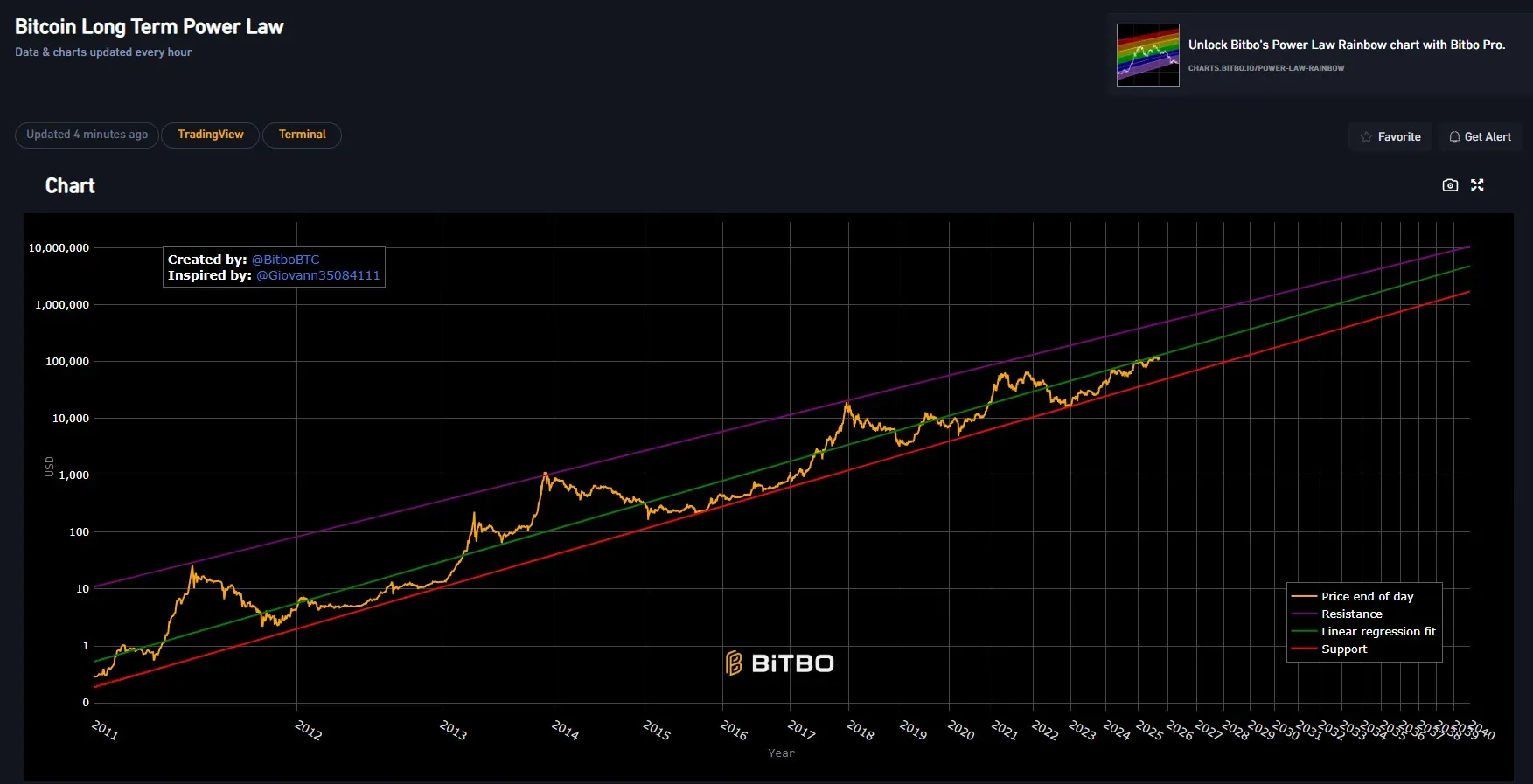
*Bitcoin (BTC) long‑term power‑law chart (creator: @BitboBTC, inspiration: @Glovann35084111)*
The Controversy Around Power‑Law Models
Power‑law models represent another attempt to find mathematical regularities amid Bitcoin’s chaotic price action. Giovanni Santostasi plotted Bitcoin’s price (log‑scaled) against time (log‑scaled) and obtained an approximately straight line, suggesting Bitcoin might follow a predictable long‑term growth pattern. Power‑law phenomena appear widely in natural and economic systems—from earthquake magnitudes to city population distributions—described by the same mathematical relationship. Santostasi argued that Bitcoin conforms to this rule, and his log‑log chart displayed striking linear consistency, attracting a legion of extreme bulls.
However, Santostasi himself acknowledged the model’s limits: it is more a description of past behavior than a guarantee of future performance. High goodness‑of‑fit does not imply the future will continue along the same path. The controversy intensified when he applied the same power‑law approach to low‑market‑cap tokens such as Kusama, prompting extreme Bitcoin bulls to question its uniqueness. If any token can exhibit a similar pattern, the model’s discriminative power diminishes. Consequently, the power‑law model has also been consigned to the “graveyard of failed models.”
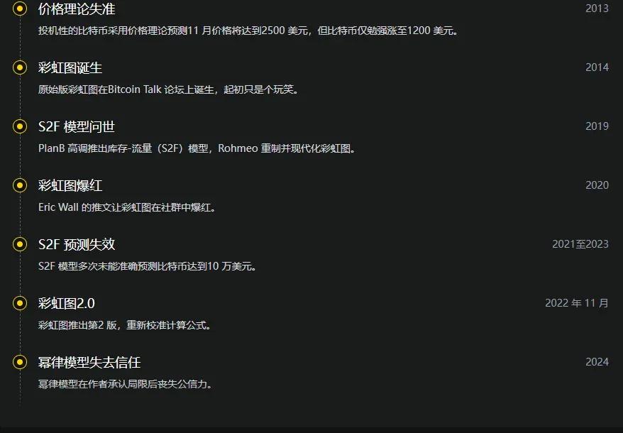
Timeline of Major Model Failures
The history of Bitcoin pricing models reads like a cycle of attempts, breakthroughs, and subsequent breakdowns:
Key Figures and Model Evolution
- Michael Saylor: Famous for “All your models are destroyed,” emphasizing that Bitcoin’s price is driven by human behavior and that any static framework struggles to anticipate moves.
- PlanB: The anonymous analyst who popularized the S2F model; reputation suffered after several forecast misses.
- Giovanni Santostasi: Injected academic flair into Bitcoin modeling with the power‑law approach, later challenged by extreme bulls when the method was applied to altcoins.
- Rohmeo: Ongoing improver of the Rainbow Chart, continuously recalibrating formulas despite repeated model failures, exemplifying pragmatism and flexibility.
- Matt Crosby (Bitcoin Magazine Pro): Advocates replacing static models with real‑time data, stressing “adaptation” over “prediction,” marking a shift toward more dynamic Bitcoin analysis.
Comparing the Models
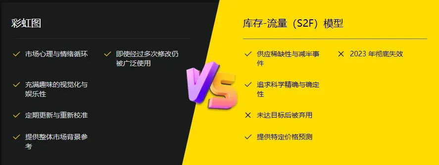
S2F relies on scarcity and halving events, aiming to provide certainty through elegant mathematics; when predictions fail, the entire framework collapses. The Rainbow Chart never claims perfection; its “joke + tool” nature lets it be adjusted as markets evolve, allowing it to survive longer.
Modern Bitcoin Analysis Techniques
Static, historical models are gradually being replaced as analysts turn to real‑time data and multi‑indicator fusion:
- On‑chain metrics: The MVRV Z‑Score gauges Bitcoin’s valuation relative to its realized market cap; SOPR (Spent Output Profit Ratio) tracks whether holders are selling at profit or loss, both serving as live sentiment gauges.
- Macro factors: Global liquidity cycles impact Bitcoin far more than early models anticipated—expansionary monetary policy typically lifts prices, while tightening depresses them.
- Institutional actions: Purchases by firms like Tesla or sovereign moves such as El Salvador adopting Bitcoin as legal tender generate price swings that no fixed formula could pre‑empt.
Lessons from Failed Models
Each failure reminds us that Bitcoin resists confinement within a single mathematical equation. The market intertwines sentiment, technological progress, and worldwide events, making precise prediction impossible. Models are better suited as visual references rather than crystal balls. They help place the current price within a historical context but cannot forecast the next step. The Rainbow Chart’s longevity stems from users understanding its limits and treating it as an auxiliary aid.
As the market matures, volatility gradually eases. Early models assumed perpetual exponential growth, but as asset size expands, each halving’s marginal impact lessens; models that ignore this maturation process will be phased out. Black‑swan events—such as the COVID‑induced liquidity surge or the FTX collapse‑driven bear market—can instantly shatter any model. Investors should avoid staking everything on a single forecast; instead, employ a toolbox of techniques and stay ready to adjust strategies.
Future Outlook for Price Discovery
Bitcoin’s price formation no longer depends on simple formulas. With a growing participant base and heightened market efficiency, real‑time data (order books, funding rates, options flow) are supplanting traditional models. Machine learning and artificial intelligence are entering the arena, capable of processing massive datasets and uncovering patterns humans might miss, yet they too falter when confronted with unprecedented events and remain only supportive tools, not oracles.
The most pragmatic stance is to acknowledge uncertainty. Bitcoin is a global financial experiment; its price reflects ongoing exploration of its role. No model can fully predict the experiment’s endpoint. Seasoned investors treat models as broad‑direction cues, stay adaptable, and prepare for multiple scenarios rather than blindly betting on a single forecast. They remember Michael Saylor’s warning: “All models will eventually be destroyed.” In the world of Bitcoin, the only constant is change itself.
Frequently Asked Questions
Why do Bitcoin price models fail?
Models often cannot anticipate “black‑swans,” such as the cascade of collapses that hit the crypto sector in 2022. Sudden macro or industry shocks render tools like S2F and the Rainbow Chart ineffective.
What is the Bitcoin Rainbow Chart?
The Rainbow Chart is a logarithmic price graph overlaid with multiple colored bands that illustrate the market’s current valuation stage. Cool‑colored zones generally suggest relative undervaluation, while warm‑colored zones hint at overvaluation or bubble risk.
Who created the Rainbow Chart?
In 2014, “Trolololo” introduced the logarithmic model; “azop” later added rainbow colors and humorous labels. Rohmeo modernized it at BlockchainCenter, turning it into the version widely used today.
What is the fundamental difference between S2F and the Rainbow Chart?
S2F is based on supply scarcity and the four‑year halving mechanism, emphasizing the quantitative side of scarcity. The Rainbow Chart focuses on demand, using historical cycles and sentiment bands to assess price positioning.
What are the main limitations of the Rainbow Chart?
Its backward‑looking bias fits historical data well but struggles to predict the impact of sudden events. It also offers limited assistance for short‑term trading, as prices can traverse multiple color zones rapidly, making precise entry/exit timing difficult.
That concludes the analysis of “Bitcoin Rainbow Chart vs. Stock‑to‑Flow Model: How to Use Tools to Explore BTC Price Movements?” For deeper dives into the Bitcoin
Related Reading
- Top Bitcoin Bottom‑Finding Indicators: RSI, MVRV, NUPL & More
- Bitcoin Under $115k After Fed Rate Cut: Futures Outlook
- BTC Markets Applies for ASIC License to Trade Tokenized RWA
💡 Register on Binance with referral code B2345 for the maximum trading fee discount. See Binance complete guide.